
A Trio of Complicated Patek Philippe “Tiffany” Watches
We take a loupe to three exemplary expressions of modern haute horlogerie, including a travel watch, grand complication and the inaugural ‘in-house’ Patek chronograph – all double-signed of course
It’s always a good day at Wristcheck when we’re able to announce Patek Philippe wristwatches of the Tiffany-stamped variety – more so should they happen to fall outside the predictable pail of Nautiluses in steel or precious metal. Recently, we were fortunate enough to be entrusted with just such a trio, from a collector whose tastes lean into a winning combination of perennial styling and mechanical complexity.
Beyond the unifying characteristic of the ‘Tiffany & Co’ signature, these three Editor’s Picks all bear the distinct mark of being produced in the modern Patek Philippe manufacture (i.e. the oldest model, a calendar complication, was released just 6 years prior). Fusing together the best of traditional European design with cutting-edge calibres, any one of these would make for a considered alternative to Patek’s relentlessly hype-y sports watch named after a mollusc. The fact they’re all double-signed? Well, that’s just the proverbial salt sprinkle on your steak.
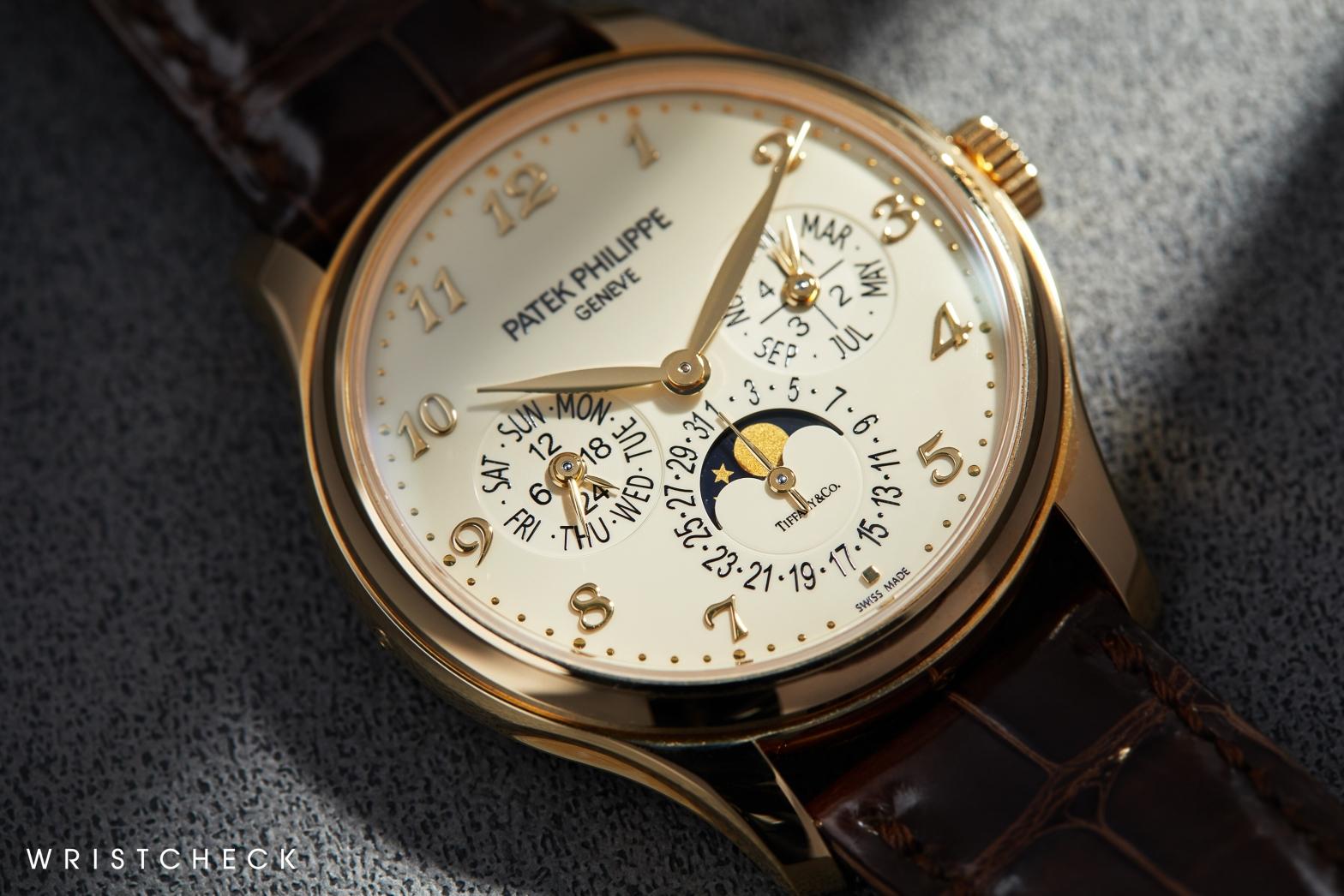
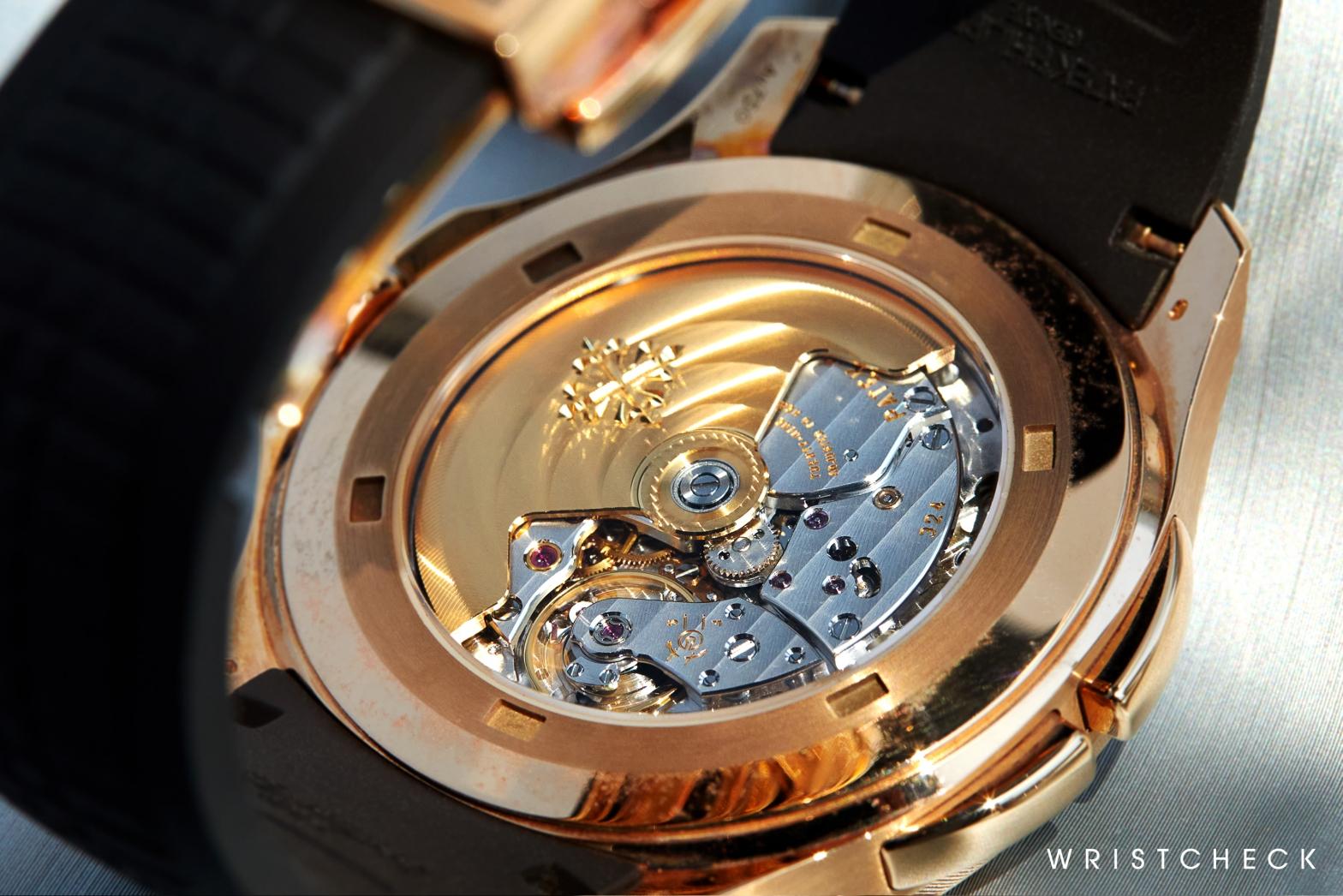
‘Grand Complication’ Perpetual Calendar (Ref. 5327J)
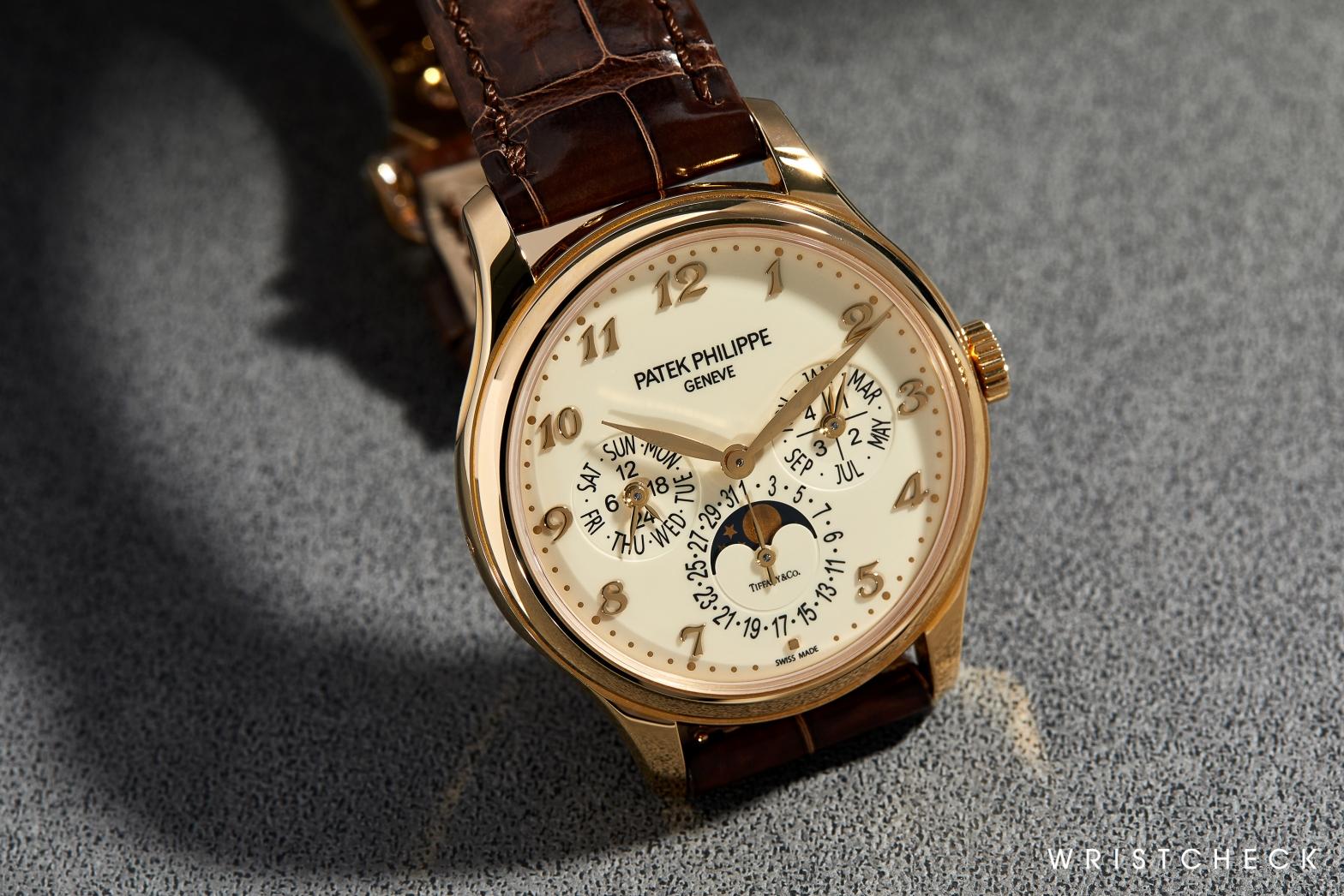
Descended from Patek Philippe’s historic lineage of self-winding perpetual calendars (including such notable references as the 5140 and 3940) the 5327 is in fact the truest expression of the brand’s horological DNA. Elegant, refined and visually reminiscent of the Calatrava, it’s not a grand comp that cries out for attention, yet proves wholly satisfying once you see it up close for even a mere handful of seconds.
On the strength of the dial alone, it’s readily apparent here that this is the Patek that Genevois bankers and old school industrialists are always raving about. The numerals – picking up on the warm tones of the surrounding gold case – are of the applied Breguet variety, and hover above the dial’s glossy ivory surface (achieved using a traditional lacquering process). The Breguet numerals and enlarged 39mm case account for the biggest visible change from the 5327’s predecessors, but rest assured: it still oozes all the dynamic tension and great holistic design for which Patek’s QPs are famed.
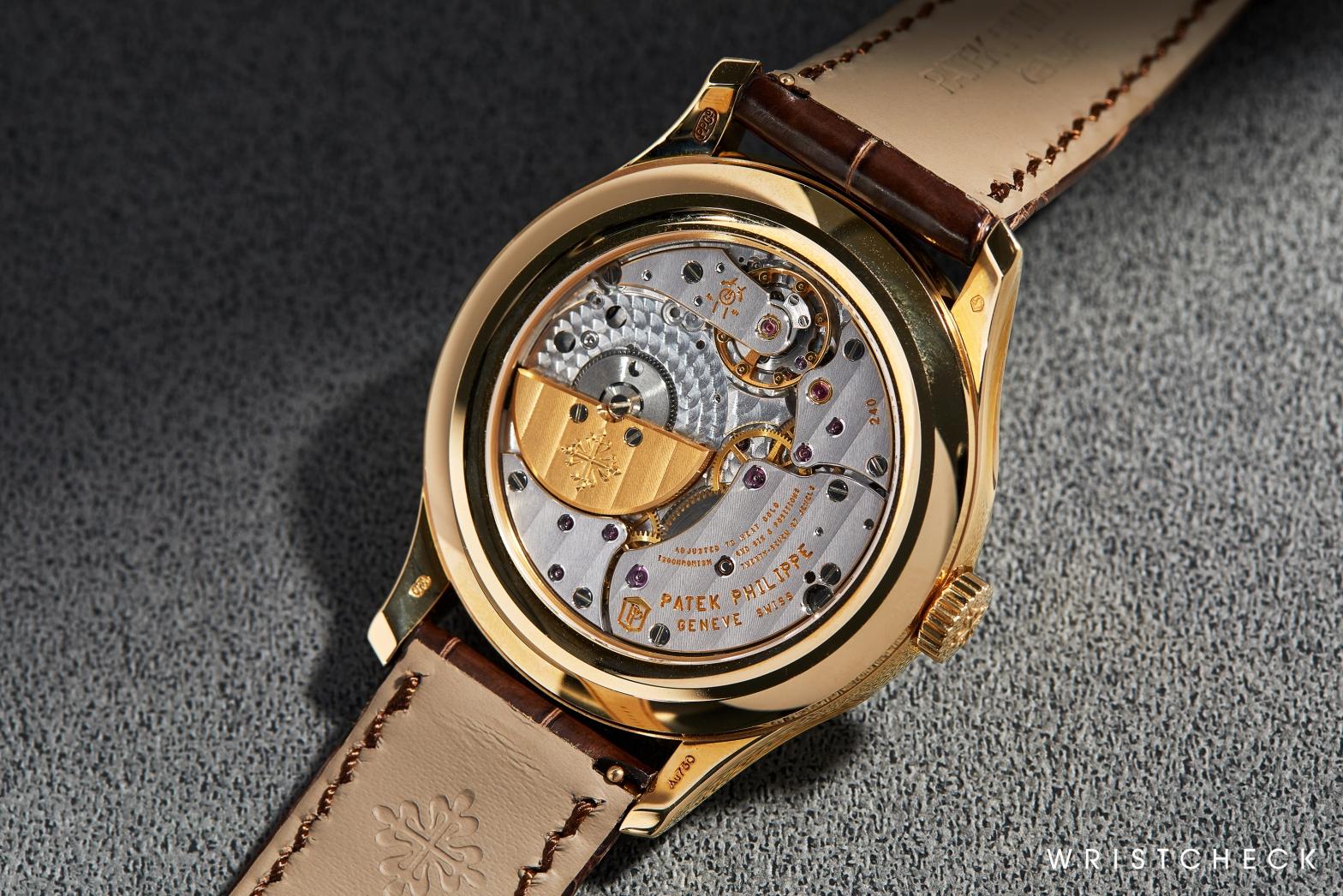
On the flipside, the movement that powers this watch is an exemplary one – the self-winding ultra-thin calibre 240Q. A favourite among purists, amateur historians and indeed anybody who has a soft spot for the intricate beauty of micro-rotors, the 240Q bore the distinction of being Patek’s first automatic perpetual calendar. Impressively thin at 3.75mm and finished to the standards of Patek’s own in-house quality seal, it is a vital piece of the company’s history that remains in production today – tracing a throughline back to the inaugural 1980s references.
Aquanaut Travel Time (Ref. 5164R)
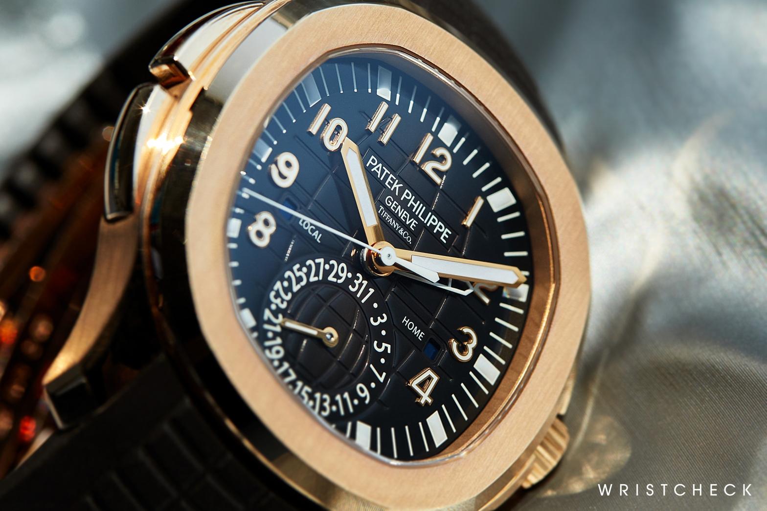
In the past I’ve half-jokingly referred to the Ref. 5164 as the universal status symbol of the ‘priority boarding’ brigade – an outburst that probably has something to do with the deep, vestigial pangs of envy most watch writers feel when we spot one of these in the wild. Known more widely as the ‘Travel Time’, this particular expression of Patek’s ‘accessible’ Aquanaut collection arrived on the market in 2016 – a full half-decade after its predecessor in stainless steel.
Very much a classic Patek ‘take’ on the ubiquitous GMT complication – elegant, intuitive, almost comically simple to use – this Aquanaut is an excellent candidate for double billing alongside the aforementioned 5327: where the latter is complicated watchmaking with a capital ‘A’, the Travel Time flits seamlessly between dual roles as ‘daily wearer’ and the ultimate frequent flier accessory. (Editor’s Note: The current owner is interested in selling this 5164R, in conjunction with his 5327J, as part of a set.)
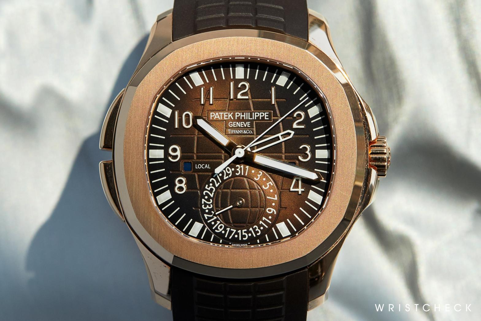
Much of this 5164’s effortless, cleanly adjudged interface comes as a direct result of what’s going on underneath. Behind the watch’s inviting facade ticks the calibre 324 S C FUS: a stalwart of the Patek catalogue (it’s currently used in over 24 of the brand’s watches) that utilises a pusher system to set local time. Unlike most GMT interfaces which are actuated via a winding crown, the inclusion of purpose-built ‘forward’ and ‘back’ pushers eliminates any need to take the 5164 off your wrist. That right there tells you everything you need to know about this watch’s raison d’etre: that it’s so ergonomic, user-friendly and carefully styled that it simply becomes part of your wrist. And that’s before we even mention the Tiffany signature.
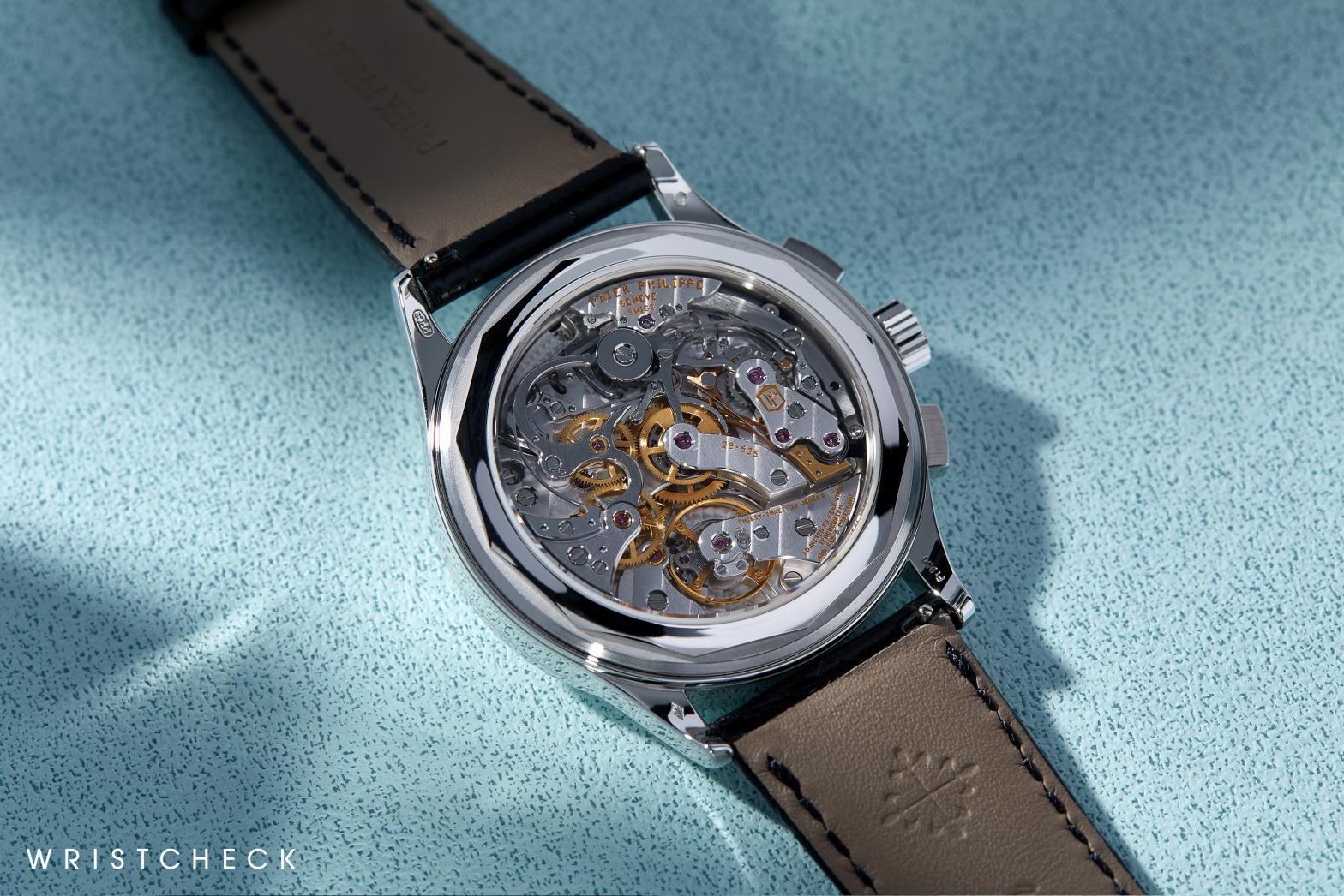
Complications Chronograph (Ref. 5170P)
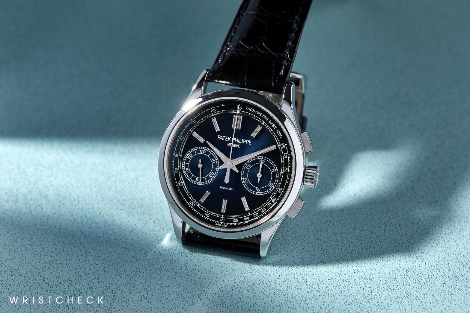
Unequivocally my favourite of the three Patek timepieces currently under discussion, this 5170 is a certifiable triple threat: an important watch in a late-stage execution that appears to be in excellent condition. Yes, the characteristic ‘Tiffany & Co’ serifs (here, positioned above 6 o’clock) are, unquestionably, a lovely, value-buoying touch. But it is what the 5170 symbolizes more widely – in the kingdom of modern hand-wound chronography – that makes it so essential among collectors.
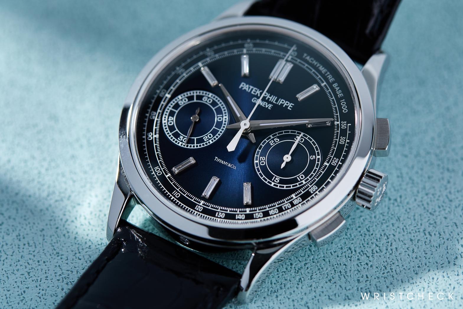
Originally introduced as the direct successor to the much-loved Ref. 5070 (hence, 5-1-7-0) back in 2010, the 5170 family was essentially a refinement of what came before. That meant a svelter case profile at 39mm (cleanly detailed, with smooth polished surfaces for the bezel and lugs) and, importantly, a new in-house movement to replace the Lemania ébauches that Patek had previously favoured– a first for the brand. Instead, this new generation of in-house chronograph was powered by a column-wheel calibre of native design: one that better explored the relation between case and movement tolerances, whilst benefiting from the best in modern technology.
This isn’t to say that the experience of wearing a 5170 – specifically in this blue-dialled, platinum configuration – is purely cerebral. As a matter of fact, the movement’s complexity and visual relationship with its surroundings make for a watch that is beautiful at every angle. Unlike its siblings in grey and yellow gold, the 5170P also possesses a dial that is visibly less baroque. In spite of its baguette-cut diamond indices, the final impression is of a very contemporary chronograph that’s likely to age well; thanks to a host of incremental details like the lumed handset, Monotype Grotesque font and gradient finish of the blue dial. In a nutshell? A modern classic.